Component Library

Navigation
Name: Nav — [Region Title]
Description
This is the main navigation component on the site and is designed with versions specific to each region, e.g. Nav — Americas, Nav — EMEA, Nav — Asia Pacific etc.
Properties
- Current State - you can use this to set the red underline for nav items on pages they are related to. The value to set here is "is-current".
Name: Breadcrumb — Main
- Base - The default one used mostly everywhere
- Grey - Used mainly in BTO
Description
This is the base component for breadcrumbs, where you have the root link and a slot to add other links on the tree as well as dividers for demarcation.
Properties
- Root Link - Select the page or enter the URL for the first breadcrumb link.
- Root Link Text - Enter the link text for the first link.
Name: Breadcrumb — Link
- Base - The default one used mostly everywhere
- BTO - Used mainly in BTO
Description
This is the link component you get to add to the slots in the Main breadcrumb component.
Properties
- Breadcrumb Link - Select the page or enter the URL for the breadcrumb link.
- Breadcrumb Link Text - Enter the link text for the first link.
Name: Breadcrumb — Divider / Breadcrumb — Divider-Dark
Description
This is the divider component you get to add to the slots in the Main breadcrumb component as demarcation.
Properties
- Visibility - Use to set the visibility of the divider as the case may be.
Name: Footer — [Region Title]
Description
This is the main footer component on the site and is designed with versions specific to each region, e.g. Footer — Americas, Footer — EMEA, Footer — Asia Pacific etc.
Sections
Name: Header
Description
This is the header component used in most inner pages.
Properties
- Heading Text - Enter your desired heading text.
- Heading Color - Select either blue, white or black for the header.
- Anchor Link ID - Enter your desired ID text for the purpose of anchoring.
- Background Image - Choose an image in the case where the header uses a background image.
- Subtext Visibility - Set the subtext wrapper to hidden or visible as the case requires.
- Background Color - Set the background combo for the subtext block as desired. You can select from the options Base, White on Grey, Grey on White, White on Light Blue or Grey on Light Blue.
Page Heading
Name: Region Header
Description
This is the region header component used mostly on region home pages.
Properties
- Heading Text - Enter your desired heading text.
- Heading Text Color - Select either blue, white or black for the header.
- Background - Select the header text background theme, choose between either dark or light.
- Background Image - Choose an image from the asset gallery as a background.
- Button Visibility - Set the subtext wrapper to hidden or visible as the case requires.
- Subtext Visibility - Set the subtext to hidden or visible as the case requires.
- Subtext - Enter desired subtext.
- Button Text - Set a text for the main CTA
- Button Link - Set a URL for the main CTA.
Heading
Add subtext here

Name: Image + Content
Description
This is featured content component with image and text.
Properties
- Heading Text - Enter your desired heading text.
- Heading Text Color - Select either blue, white or black for the header.
- Image - Choose and image from the asset library.
- Background Color - set background colour using either of the classes below
- background-color-white
- background-color-lightblue
- background-color-brightblue
- background-color-lavender
- background-color-secondary
- background-color-ocean
- background-color-grey
Heading

Heading
Name: Horizontal Tabs / 4 Items
Description
This is tab component with possible entries for four items. You can add ritchtext content into the slot on the tab content section.
Properties
- Label - Enter a label for the tab nav.
- Image - Select desired image for the tab.
- Heading Text - Enter your desired heading text.

Heading

Heading

Heading

Heading
Name: Awards Highlight
Description
This is the awards highlight component, used to show achievments as it pertains to a certain subject/page.
Properties
- Award 1, 2, 3 - Title - Enter the main title for the award.
- Award 1, 2, 3 - Desc - Enter a descriptive subtext.
- Link - Visibility - Set the bottom link to visible or hidden.
- Link - URL - Enter a URL for the link.
- Link - Text - Enter a CTA text for the link.
- Footnote - Visibility - Set the footnote to visible or hidden.
- Footnote - Text - Enter desired text for footnote.
Banners
Name: Banner — CTA
Description
This is the info banner component with a CTA, used within sections.
Properties
- Heading Text — Enter the desired text for the main banner headline.
- Heading Large - Visibility — Set the larger header visibility.
- Heading Small - Visibility — Set the smaller header visibility.
- CTA - Text — Enter a text for the banner CTA button.
- CTA - Link — Enter the URL for the banner CTA button.
Name: Section-Banner — CTA
Description
This is the full section info banner component with a CTA and fullwidth plain background.
Properties
- Header - Visibility — Set visibility on the main component header.
- Header - Text — Enter desired text for the main component header.
- Header Large - Visibility — Set visibility on the larger header.
- Header Large - Text— Enter desired text for the larger header.
- CTA - Text — Enter a text for the banner CTA button.
- CTA - Link — Enter the URL for the banner CTA button.
- Column Layout Addon — use classes to set the number of columns available on the content region. See available classes below:
- is-3col — Set the banner content to 3 columns.
- is-alt — Set the banner content to 1 column.
- Mid-Text Visibility — Set the visibility of the mid-text in 3 column instances.
- Mid-Text Content — Enter the desired text for the mid-text in 3 column instances.
- Secondary Button - Visibility — Set visibility for outlined secondary button.
- Primary Button - Visibility— Set visibility for solid primary button.
Name: Section-Banner — CTA [Bg Image]
Description
This is the full section info banner component with a CTA and fullwidth background image.
Properties
- Header - Visibility — Set visibility on the main component header.
- Header - Text — Enter desired text for the main component header.
- Header Large - Visibility — Set visibility on the larger header.
- Header Large - Text— Enter desired text for the larger header.
- CTA - Text — Enter a text for the banner CTA button.
- CTA - Link — Enter the URL for the banner CTA button.
- Column Layout Addon — use classes to set the number of columns available on the content region. See available classes below:
- is-3col — Set the banner content to 3 columns.
- is-alt — Set the banner content to 1 column.
- Mid-Text Visibility — Set the visibility of the mid-text in 3 column instances.
- Mid-Text Content — Enter the desired text for the mid-text in 3 column instances.
- Secondary Button - Visibility — Set visibility for outlined secondary button.
- Primary Button - Visibility— Set visibility for solid primary button.
- Background Image — select desired image for background from the assets gallery.

Name: Top-Banner — Text
Description
This is the full section info banner component, usually used at the top of the page below the navigation.
Properties
- Banner - Text — Enter the desired info text for the banner.
- Banner - Visibility —Set banner visibility in localized instances.
Tables
Fiscal Year
Cash Dividends Declared per Share
Interim
The Term End
FY 2002
–
JPY0
–
FY 2001
JPY3,500
JPY0
JPY3,500
FY 2000
JPY7,000*3
JPY3,500*3
JPY3,500*3
Name: Table — Body
- Base - The default styling with borders on rows/columns.
- No Border - Option to use tables without borders on rows/columns.
Description
This is the main table component that has the slot where all Table — Row components can be added.
Name: Table — Row
Description
This is the table row component used to set up individual rows on a table.
Name: Table — Column
Description
This is the column component to be used to group cells within a row.
Properties
- Width - Define the width by entering a value divisible by 5 between 5-100. This value should be preceeded by an underscore i.e, "_5". "_25", "_65". Ensure all cells/columns within a row add up to 100%.
Name: Table — Cell
- Base - The default cell layout for text left aligned.
- Base -- Centered - The cell layout for text center aligned.
- Heading -- Left - The cell layout for headings left aligned.
- Heading -- Centered - The cell layout for headings center aligned.
Description
This is the cell component used to fill in the content of the table as text or heading.
Properties
- Width - Define the width by entering a value divisible by 5 between 5-100. This value should be preceded by an underscore i.e, "_5". "_25", "_65". Ensure all cells/columns within a row add up to 100%.
Edit Cell Content
Cards
Name: Card — People
Description
This is the card component for people, used usually to showcase team members in a particular region.
Properties
- Profile Image - Select an image from the assets gallery.
- Name - Set the name of the person represented.
- Region - Enter the region they belong.
- Role - Enter their role in full.
- Team - Enter their respective team.
- Link - Connect the page or URL for their bio page.

Name: Card — People Alt
Description
This is an alternative card component for people, used usually to display team members as part of a specific information.
Properties
- Profile Image - Select an image from the assets gallery.
- Name - Set the name of the person represented.
- Region - Enter the region they belong.
- Role + Team - Enter their role, team or both as the case may be.
- More details 1 & 2 - Enter additional information like phone number or email.

Name: Flip Cards
Description
This is an information card component that displays additional info on hover.
Properties
- Title - Enter the main text/title for the item.
- Hovered Text - Enter the body of text you want displayed on hover.
Clients First
Name: Card — Resource-Preview
Description
This is the resources component, used for news, insights and other resources.

Content
Name: Content — Richtext
Description
This is a richtext component, designed to cases where blocks of formatted texts are needed without having to set the elements like headings, lists, links paragraphs etc. individually. It can also be used to add code embeds.
Properties
- Rich Text Content - Enter the desired content.
- Class Add-on - Set addon classes to style richtext elements in specific ways.
- Visibility - Set visibility on or off.
- ID - Used to add an ID to the block, for in-line linking purposes.
Available addon classes
- is-centered - to center h1 and h2 headings
- h3-centered - to center h3 headings
- alphabet-list - to set unordered lists to use alphabet bullets
- h1-centered - to center h1 headings only
- h1-left - to align h1 headings left
- h4-light - to set h4 heading text to light weight
- h3-text-blue - set h3 headings to have blue text color
- dark-link-list - set links on unordered lists to use underlined dark text styling.
Heading 1
Heading 2
Heading 3
Heading 4
Heading 5
Heading 6
Lorem ipsum dolor sit amet, consectetur adipiscing elit, sed do eiusmod tempor incididunt ut labore et dolore magna aliqua. Ut enim ad minim veniam, quis nostrud exercitation ullamco laboris nisi ut aliquip ex ea commodo consequat. Duis aute irure dolor in reprehenderit in voluptate velit esse cillum dolore eu fugiat nulla pariatur.
Block quote
Ordered list
- Item 1
- Item 2
- Item 3
Unordered list
- Item A
- Item B
- Item C
Bold text
Name: Content — Callout
Description
This is a wrapped richtext component with the grey background, mostly used for callouts and highlighted content.
Properties
- Visibility — Set component visibility as the case may be.
- Callout - Text — Enter the main text content for the block.
- Callout Richtext - Visibility — Set visibility for the text content.
- Centered Heading — Use classes to center the heading.
- Highlight - Visibility — Set visibility on 3-column highlight images block.
- Highlight 1,2,3 - Image — Select preferred image from asset gallery for highlight image.
- Highlight 1,2,3 Text - Visibility — Set visibility on highlight image caption.
- 2 Column - Visibility — Set visibility for a 2-column slot.
- 3 Column - Visibility — Set visibility for a 3-column slot.
- List - Visibility — Set visibility for a list slot.
Pick Up
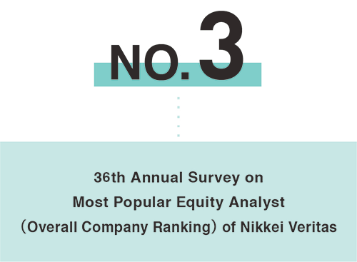
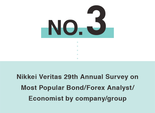
Year after year, we continue to be recognized as the top research house in Japan for both equities and fixed income.
For equity research, in February 2025, we has been awarded first place in the 32nd annual Japan Research Team survey run by Extel (formerly the Institutional Investor Survey) . We ranked 3rd among all research houses for the Nikkei Veritas 2024 "36th Popular Equity Analyst Survey." Seven of our analysts ranked 1st in individual category rankings.
For bond research, Mizuho Financial Group ranked 3rd among all companies and groups for the Nikkei Veritas 2024 "29th Popular Bond/Forex Analyst/Economist Survey." One of our analysts ranked 1st in individual category rankings.
While our achievements are notable, our quest to enhance our research capabilities to offer unsurpassable solutions tailored to the diverse needs of our clients is unending.

Name: Accordion Item
Description
This is an accordion component with a main heading as a toggle that shows additional content on click.
Properties
- Title — Enter desired title for accordion.
- Rich Text Content — Enter desired body content for the accordion.
- Class Add-on — Set addon classes to style richtext elements.
Title
Heading 3
Lorem ipsum dolor sit amet, consectetur adipiscing elit, sed do eiusmod tempor incididunt ut labore et dolore magna aliqua. Ut enim ad minim veniam, quis nostrud exercitation ullamco laboris nisi ut aliquip ex ea commodo consequat. Duis aute irure dolor in reprehenderit in voluptate velit esse cillum dolore eu fugiat nulla pariatur.
Name: Content — Heading
Description
This is a heading component used within nested content.
Properties
- Heading Tag — Select preferred heading level/size between h1 - h6.
- Heading Text — Enter the desired heading text.
- Class Addon — Optionally add a CSS class to apply custom styles to this heading.
- ID — Enter an ID text for the purpose of anchor linking.
Heading
Heading
Heading
Name: Content — Insights-List
Description
This is the main list component for bulleted items with additional details. It has a slot to add as many list items as needed.
Properties
- Visibility — Set the list to hidden or visible as desired.
Nested Item: Content — Insights-List-Item
Description
This is the list item component with additional details mostly used for news and insights listings.
Properties
- Visibility — Set component visibility as the case may be.
- Item Title — Enter the main list item text/title.
- Text - Visibility — Set visibility for text when the item is not a link.
- Link - Visibility— Set visibility for link when the item is not plain text.
- Link - URL — Enter desired link URL for item.
- Subtext - Visibility — Set visibility for subtext/secondary bottom content.
- Subtext Content — Enter desired text content for subtext.
- Subtext Label - Visibility— Set visibility for bottom label.
- Subtext Label - Text— Enter desired text for bottom label.
- Footnote - Visibility — Set visibility for footnote text.
- Footnote - Text— Enter desired text for footnote.
Nested Item: Content — Insights-List-Item
Description
This a list item component with richtext content in cases of multiple links available for a single item
Properties
- Rich Text Content — Enter the desired list content.
- Date — Enter the corresponding publication date for the item.
Publication of Financial Statements
Mizuho Financial Group Annual Report (Year ended March 2022) - English
Mizuho Financial Group Annual Report (Year ended March 2022) - Chinese
Mizuho Financial Group Annual Report (Year ended March 2022) - Malay
Mizuho Financial Group Annual Report (Year ended March 2022) - Tamil
Sep 7 , 2022
Name: Content — List-Main
Description
This is a regular unordered list component with no bullet, can take both links and plain text items.
Nested Item: Content — List-Link
Description
This is the list item for links
Properties
- Text - Enter the desired text
- Link - Enter the URL you wish to point to
Nested Item: Content — List-Text
Description
This is the list item for plain texts
Properties
- Text - Enter the desired text
Name: Divider Horizontal
Description
This is the horizontal divider component
Name: Content — Columns
Description
This is a wrapped richtext component with the grey background, mostly used for callouts and highlighted content.
Name: Content — Spacer 2
Description
This is spacer component, used to in nested content instances to add space.
Name: Content — Section Wrapper
Description
This is section wrapper component, used to keep multiple other nested content elements in one group with the option of adding an ID for anchor linking.
Properties
- Text - Enter the desired text